
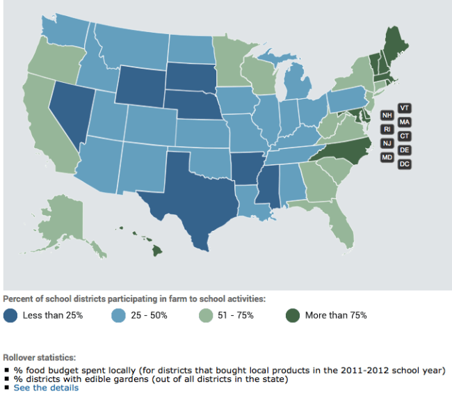
The USDA has just released a really excellent website and exploratory tool for their recent Farm-to-School Census. The website is lovely because it starts with a national level summary, presented as an nicely designed fun-to-read infographic. Then comes the national map with nice little data roll-overs for each state. Click on a state and you are presented with a full infographic customized for that state! You can then drill-down to the individual school districts to see how your local schools are doing. It is really a wonderful example of good web design, good communication and good scientific transparency, and all on an important topic! Click on the map below to see it in action!
www.fns.usda.gov/farmtoschool/census#/map

